Farmacity Profile
Redesign of the benefits program with exclusive perks for members
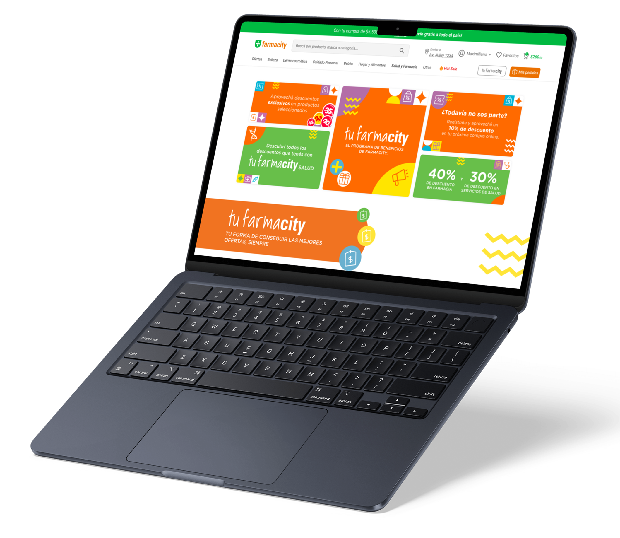
For the past 4 years, I have been working as a UX/UI designer at Farmacity, and now i am leading the redesign of Tu Farmacity, a massive digital initiative that offers endless discounts and health benefits to its members. The program is completely free and provides exclusive deals on medications, wellness products, and personalized member-only perks, including the ability to create affinity groups to share and maximize benefits. This project is so large that it cannot be fully captured on a single page, but I’d be happy to provide further details upon request.
View Case Study
Farmacity’s previous benefits program lacked modern design, consistency, and an engaging user experience. The challenge was to create a unified, scalable platform that clearly communicates value, increases user engagement, and supports the growing demand for digital health and wellness benefits.
Problems to solve
- Fragmented experience: multiple disconnected promotions confused users.
- No clear value communication: users were unaware of the program’s full range of benefits.
- Lack of personalization: no affinity groups or tailored recommendations existed.
- Visual inconsistency: outdated components and poor responsiveness.


I led the UX/UI initiatives end-to-end: Research, design, prototyping, and testing, while collaborating with product managers, developers, and marketing teams to ensure a scalable, consistent experience for millions of users.
Scope & Complexity
The “Tu Farmacity” project involved a complete redesign of the entire customer benefits ecosystem:
- 3 millions of member-only discounts and exclusive promotions.
- Health and wellness benefits integrated with prescriptions and digital pharmacy services.
- Creation of Affinity Groups allowing users to join communities and share perks.
- Integration with mobile app, e-commerce, and in-store experiences.
Given the project’s size and impact, it’s not possible to explain everything on a single page — but I can provide a full detailed walkthrough if you'd like to explore more.
The process
1. UX Research
Conducted surveys and usability tests with members to understand current pain points and expectations.
2. Information Architecture
Simplified navigation, grouped benefits logically, and introduced filters for easier discovery.
3. Design System
Built scalable UI components and tokens to ensure visual consistency across web and mobile.
4. Feature Expansion
Designed new “Affinity Groups” functionality to increase community engagement.
UX/UI Design Approach
The redesign followed a systematic UX approach with iterative testing and collaboration across teams. Our design system accelerated development cycles and improved consistency.
- Scalable Components: 200+ reusable elements built for future features.
- Optimized Flows: Reduced steps for joining the program and claiming benefits.
- Accessibility: WCAG-compliant design for inclusive usage.
- Mobile-first: Enhanced navigation for better mobile experience.
This approach resulted in unified design language and significant improvement in user engagement across platforms.
Want to explore the full project? Contact me and I’ll share detailed internal documentation.

Tu Farmacity in action
Results & Impact
The redesigned program delivered tangible benefits:
- Consistency: Unified design across all digital and physical touchpoints.
- Engagement: Increased member sign-ups and higher usage of discounts.
- Efficiency: 40% faster design-to-dev handoff with design system adoption.
- Performance: 25% faster mobile app load time and smoother navigation.
This project showcases how a strong UX/UI strategy and scalable design system can modernize a large-scale benefits program like Tu Farmacity, improving value delivery to millions of members.